Nourishing Schools
Designing a Motion-First Identity for a
Mission-Driven Brand
Introduction
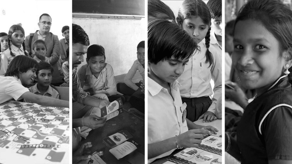
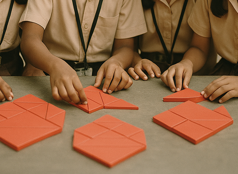
Nourishing Schools Foundation works to enable children to become change-makers for better nutrition and health within their schools and communities. By integrating nutrition education into everyday classroom experiences, the foundation helps children understand the power of nourishment and take small but significant steps toward healthier futures. Through its toolkits, games, and playful learning experiences, Nourishing Schools has reached thousands of children across India—sparking awareness, transformation, and lasting change.
Brief
The static logo worked perfectly as a design — strong, balanced, and meaningful. But to fully express what Niqo stood for — collective progress and human victory through technology — it needed to move.
Kooky Co was brought in to translate the logo into motion and sound, creating a sensory logo system that could emotionally communicate Niqo’s belief in liberation, unity, and triumph.
Challenge
A static logo tells the outcome — but not the journey.
Niqo’s flag symbolized victory, yet it couldn’t convey the energy behind that victory — the people, the pulse, the collective voice.
In a digital-first world, where identities live in motion, the challenge was clear:
How do we make a static mark feel alive, without losing its symbolic integrity?
How do we help audiences feel the liberation, not just see it?
How do we help audiences feel the liberation, not just see it?
Phase 1:
Understand and
Diagnose Product
Beliefs
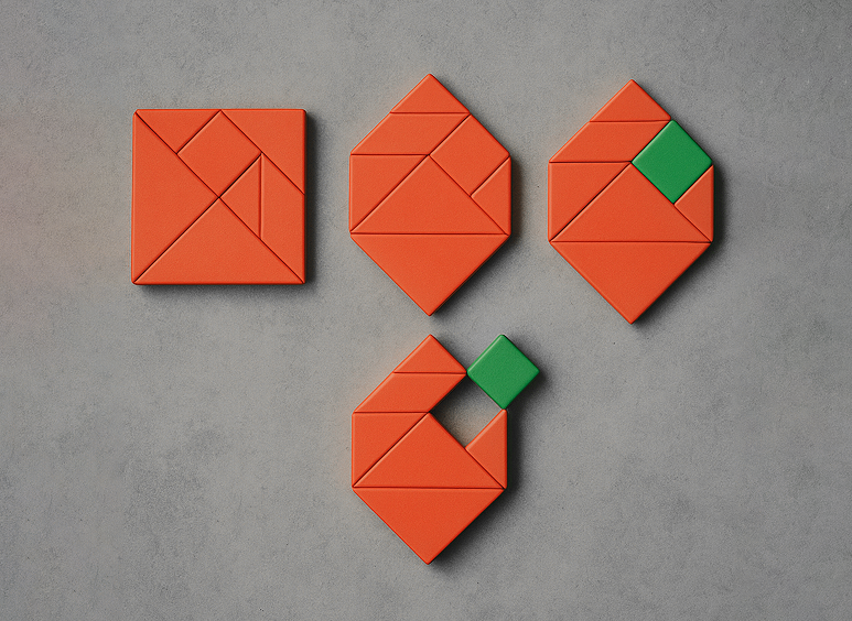
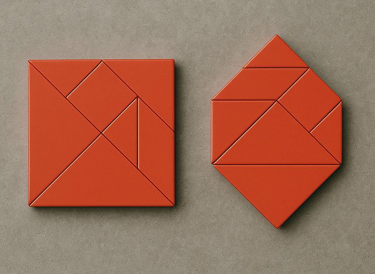
Since 2014, Nourishing Schools’ logo—built on the tangram—has stood as a symbol of seeds of change. The tangram represents the many pieces that come together to catalyse nutrition awareness: knowledge, community, children, and growth. Yet, while the logo beautifully expressed unity, it remained still—a snapshot rather than a story.
At Kooky Co, we approached the problem not as a design task but as a belief translation. We asked: How can this symbol embody motion, evolution, and growth—the same way the program nurtures them in children?
We found that the seed in the logo wasn’t just a metaphor for nourishment—it was a visual model of transformation itself. Our task became to make that growth come alive: to let the tangram tell its own story through motion.
The challenge was strategic, not aesthetic:
How do we express the brand’s transformational belief in a way that can live across today’s motion-led, digital environments?
Phase 2: Design —
Applying Sensory
Heuristics to Shift
Beliefs
Once we identified transformation as the core narrative, Kooky Co began building a sensory communication system—one that could trigger both recognition and emotion.
We weren’t creating “a logo animation”; we were designing a shared moment—a small, repeatable cue that would build familiarity, recall, and pride among everyone connected to Nourishing Schools.
Kooky Co — Sensory Heuristics Framework
1. Movement as narrative – The logo’s animation should not just move; it should evolve. The tangram pieces unfold and align, forming a seed that begins to sprout—mirroring the journey from awareness → transformation → change.
2. Sound as emotional recall – The soundscape draws from a universal memory: the school bell. That unmistakable ring that instantly lights up a classroom, followed by laughter, movement, and joy. For many, especially in rural schools, that bell is not just sound—it’s a shared childhood rhythm. We used that as our auditory anchor: the sound of possibility, of something beginning.
3. Color as warmth and vitality – The tangram pieces’ colours—orange and warm tones—represent the colour of seed and the warmth of community transformation. From these tones emerges a green sprout, signifying renewal, life, and the growing impact of Nourishing Schools.

4. Play to purpose – The motion flows from playful tangram assembly to purposeful growth. What begins as a puzzle ends as a sprout—echoing how playful learning in Nourishing Schools toolkits leads to real, measurable transformation.
Together, these heuristics created a design framework that translated the brand’s philosophy into a multisensory language.
The identity no longer described transformation—it demonstrated it.
Phase 3: Build and
Scale — From Symbol
to Sensory Identity
Kooky Co built a crisp five-second logo animation, designed for instant recognition and emotional resonance across digital platforms, toolkits, and classroom projections.

Kooky Co built a crisp five-second logo animation, designed for instant recognition and emotional resonance across digital platforms, toolkits, and classroom projections.
The animation opens with the ring of a school bell—the kind that makes every child look up, excited. Tangram pieces come together fluidly, transforming into a seed that sprouts—a visual echo of growth, nourishment, and transformation. The short duration captures attention, tells the story, and builds recall without losing simplicity.
The motion and sound together capture the concept of nutrition education through play—the very essence of what Nourishing Schools deploys through its toolkits. The animation feels reminiscent of the joy and curiosity children express when they play with Nourishing Schools’ games. It’s a sensory celebration of their engagement—a visual rhythm that mirrors how learning and laughter coexist in every session.
As the bell rings, it doesn’t just signal the end or start of a class—it heralds the beginning of a new period: one of play, change-making, and transformation. A simple sound, a few moving shapes, and suddenly, the logo becomes a bridge between the joy of learning and the power of nourishment.
Outcome
By reimagining a static identity as a sensory ritual, Nourishing Schools gained more than a moving logo—it gained a living symbol.
For Kooky Co, the engagement went beyond design delivery.
It was a shared act of belief design—helping a mission-driven organization translate its purpose into an emotion people can feel and remember.